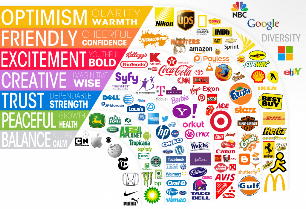
The Science of Colors in Marketing | Which colors trigger which feeling for us
Colors play a crucial role in marketing, as they evoke specific emotions and feelings in consumers. They have a remarkable ability to influence our perceptions, and in the world of marketing, this is leveraged to create powerful brand identities. So how do colors really affect us and what is the science of colors in marketing really?
The Science of Colors in Marketing | Which colors trigger which feeling for us
Blue
Known for its calming effect, blue conveys trust & professionalism. It’s widely used in corporate branding and industries focused on technology and healthcare.The networking platform of LinkedIn incorporates blue to project professionalism . Social media companies Facebook and Twitter frequently choose blue to make them appear dependable, a crucial trait for businesses that store a ton of user data. IBM, a global technology and consulting company, incorporates blue in its logo to project a professional and trustworthy image.
Red
Red creates a sense of urgency and stimulate appetite, making it popular in food and retail industries. One of the most iconic examples, Coca-Cola uses red in its logo and packaging to evoke a sense of energy and happiness.The fast-food giant McDonald’s ,red in its logo and restaurant decor creates a sense of appetite stimulation. The red play button in YouTube’s logo signifies action and entertainment, encouraging viewers to engage with content.
Black
Black represents sophistication, elegance, and power. It’s commonly used in luxury brands to convey a sense of exclusivity and timelessness. The iconic automotive brand Mercedes-Benz uses black in its logo and branding to signify luxury, and excellence in engineering. The tech giant Apple often uses black in its product designs and packaging. Gucci, another luxury fashion brand, frequently incorporates black in its designs.
Green
Associated with nature and growth, green represents freshness, health, and sustainability. The television network Animal Planet, incorporates green into its branding to symbolize nature, wildlife, and conservation. The coffeehouse chain Starbucks uses green in its logo and branding to evoke a sense of freshness, natural ingredients, and a commitment to sustainability. The fruit juice company uses green in its logo to highlight the freshness and natural origins of its products.
Yellow
Yellow is bright and cheerful, evoking feelings of optimism, happiness, and positivity. Snapchat uses a bright yellow ghost as its logo, which represents fun, creativity, and a lively social atmosphere. Lays uses yellow in its packaging to create a sense of energy, fun, and enjoyment associated with snacking. The animated characters of Minions are known for their vibrant yellow color, symbolizing fun, mischief, and a cheerful disposition.
White
White symbolise purity, cleanliness, and simplicity, so a sense of clarity and openness. The search engine giant Google uses a clean, white background in its homepage design, conveying clarity and ease of use. Dove utilizes white in its branding to convey purity. Tesla incorporates white in its design, symbolizing a clean, futuristic approach to transportation.
Purple
Purple is a color of luxury, creativity, and spirituality. It evokes a sense of elegance and sophistication. So, popular in industries like beauty, fashion, and high-end products. The Canadian whisky brand Crown Royal uses purple in its packaging, symbolizing refinement, and premium quality. The famous chocolate brand Cadbury uses purple in its packaging and logo, symbolizing richness & quality. Hallmark, the famous gift card company, uses purple background to help people associate their brand with feelings of nostalgic sentiments and luxury.
Orange
Orange exudes warmth and excitement used to create a sense of fun and playfulness. Especially in industries related to entertainment and leisure. The portable speaker series “Pulse” from JBL often features shades of orange, symbolizing energy and dynamic sound experiences. The children’s television network Nick Jr uses orange in its branding, conveying a sense of creativity and playful learning. The web browser Mozilla uses a distinctive orange fox logo, representing dynamic online experiences.
Pink
Pink is often associated with femininity, romance, and sweetness. It’s popular in industries related to products targeted towards a female audience. You will see iconic doll brand Barbie often featuring pink in its design & packaging. The beloved character and franchise Hello Kitty is mostly associated with pink. The lingerie and beauty brand Victoria’s Secret prominently features pink in its branding, symbolizing femininity, sensuality, and confidence.
Final Takeaway
Each color carries its own set of associations and emotions, influencing how consumers perceive and connect with a brand. From the energetic red to the calming blue, and the playful pink to the sophisticated black, color choices have a profound impact on our consumer behavior and decision-making. By leveraging The Science of Colors in Marketing & other areas we can elevate our core message and create meaningful experiences for others.
Also, the next time you see a logo or packaging, think about the feelings it’s trying to evoke. It’s a fascinating world of color psychology!
For further insights, read Color Psychology https://amzn.to/45K3Z9L
Read also : Are You An Architect Or Archeologist Of Your Life ? https://thebrightdelights.com/are-you-an-architect-or-archeologist-of-your-life/